In our busy, fast-paced world, your home should be your safe place. It needs to be a spot where stress can disappear and real relaxation can begin. The key to creating this peaceful sanctuary often lies in the most basic part of design: color Ideas. The shades you pick for your walls, furniture, and small details greatly change your mood, energy, and overall feeling of peace.
This full guide offers 16 incredible Color Ideas for calming tones, all drawn straight from nature. These concepts will help you create a space that is not just beautiful, but deeply peaceful. These palettes use colors that are not too bright, focusing instead on natural connections and a feeling of calm that is completely unforced.
Color Ideas for Earthy Neutral Palette
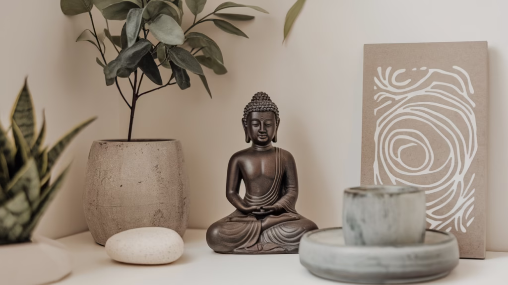
The Earthy Neutral Palette is the main color plan for most Zen-style rooms. It is made to feel grounded and natural, like the quiet, slow tones of the earth. These colors work together to offer a soft, welcoming background. This background helps you feel still and supports quiet thought.
Hues for a Grounded and Stable Space
1. Warm Beiges: The Gentle Hug
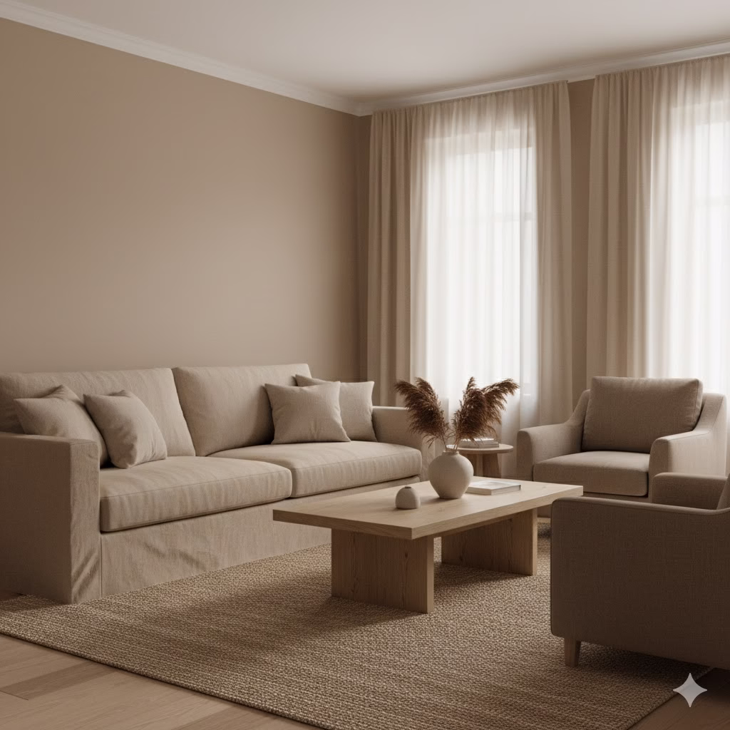
Warm and soft tones like sand, taupe, or creamy beige give you a welcoming and soft background. These colors are great for your main wall color. They reflect light nicely and stop a room from feeling too stark or cold. A light taupe, for example, has the warmth of brown but is lighter. This makes a room feel large but still cozy.
Practical Tip: Use beige on all four walls to create a seamless, soft “hug” effect. This unbroken color field helps the mind relax.
2. Creamy Whites: Light Without the Glare

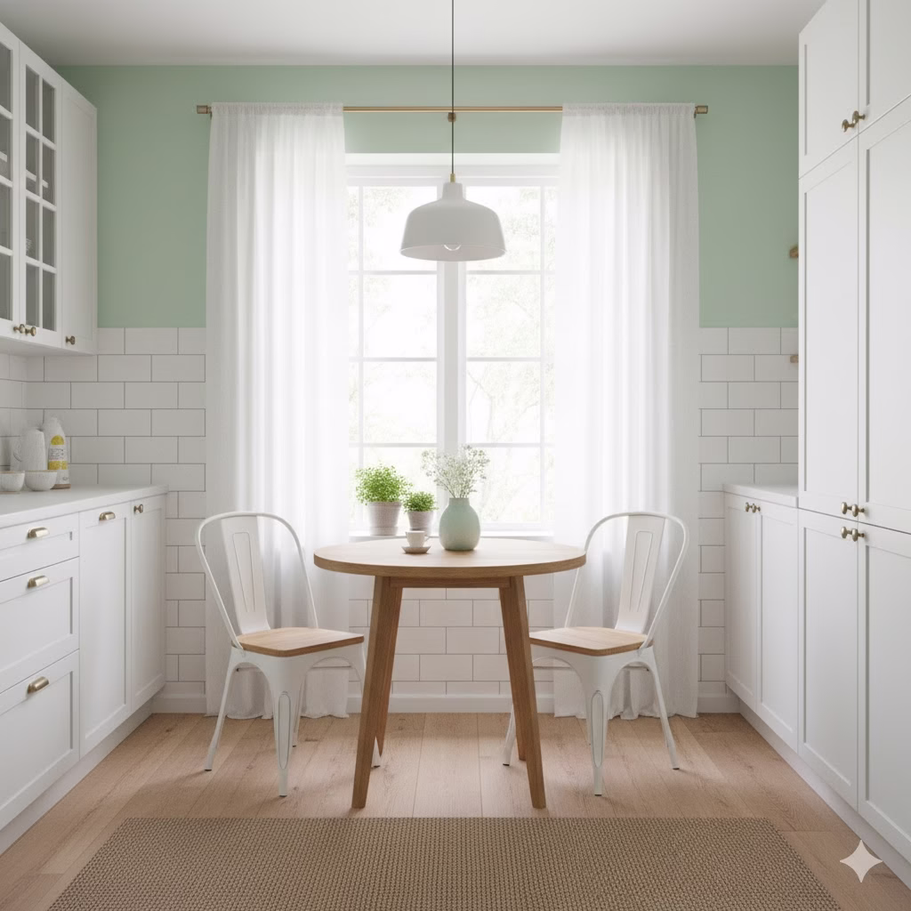
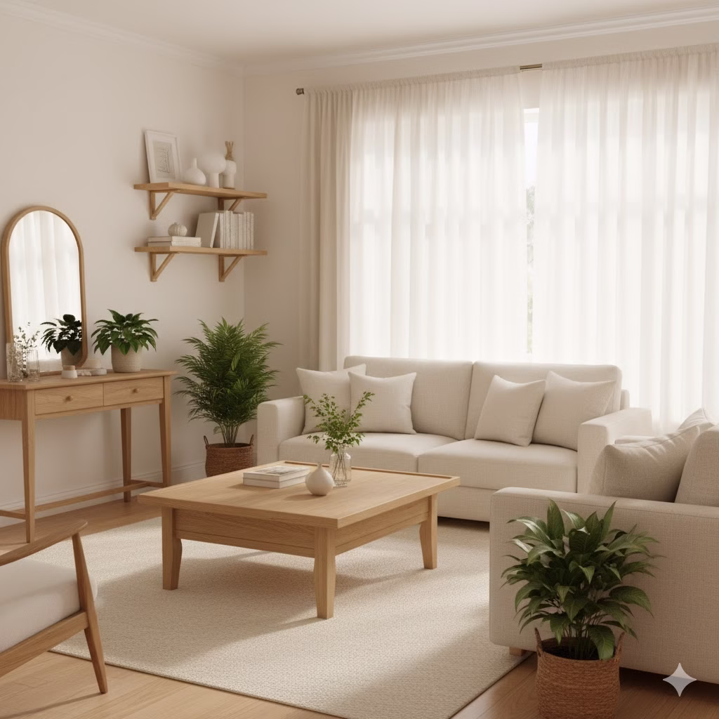
Forget the harsh, hospital-like white. The Zen style prefers creamy, off-white, and bone shades. These give a feeling of purity and openness without being too strong. An off-white acts as a perfect setting for natural wood and woven textures. It softly smooths out all the light that touches it.
Choosing the Right Cream: Test whites that have a tiny yellow or brown tint. This hint of color is what makes the shade “warm” and keeps it from feeling cold in the evening.
3. Soft Greys: Calm and Simple Style
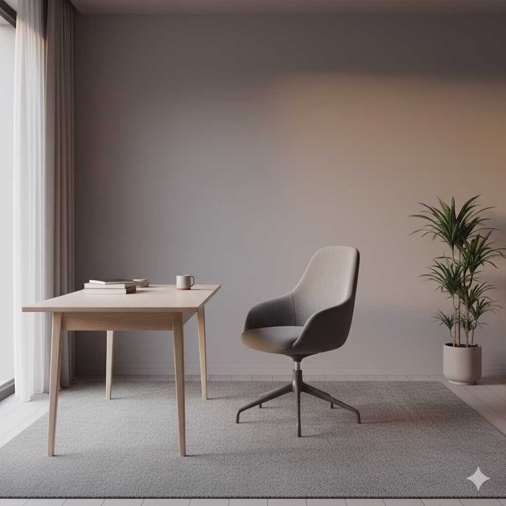
Soft, gentle greys can create a calm and stylish mood. The main thing here is to pick shades with warm undertones. This means they have a little bit of brown or yellow mixed in. This stops the space from feeling cold or unfriendly. These simple, clever neutrals are useful and look great with almost every other color on this list.
Why Warm Grey Works: Cool grey can feel modern, but warm grey (often called ‘greige’) is timeless. It connects the coolness of grey with the comfort of beige.
4. Color Ideas for Muted Browns: A Link to Nature
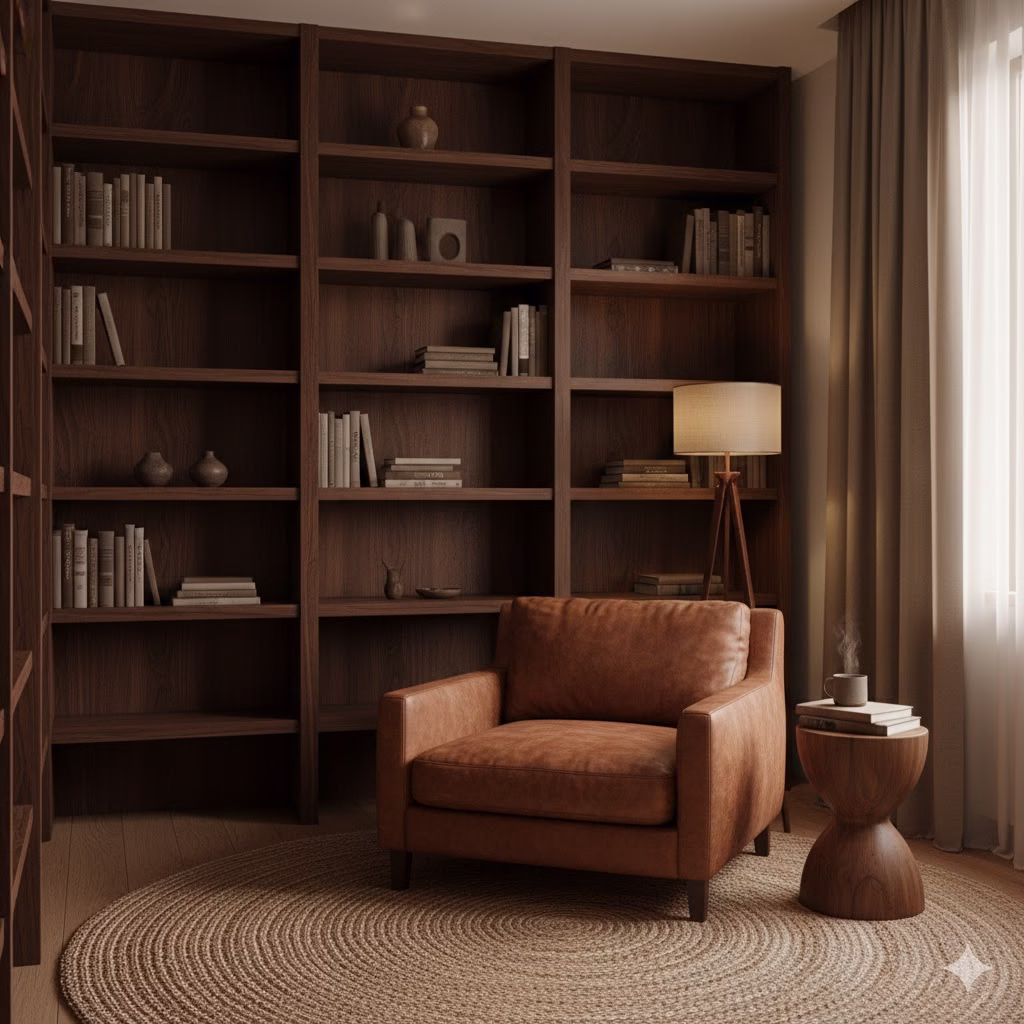
Using muted browns and natural wood tones quickly adds warmth, comfort, and a clear, strong connection to nature. Think of the color of simple teak wood, dark walnut, or even a soft, cocoa-like brown for blankets and pillows. These are the heavy anchors of the room. They are best added through furniture, floors, or door frames.
Adding Brown: Use brown in small amounts, mainly through wood. A brown accent wall might be too heavy. Instead, use a simple wooden bench or a natural jute rug.
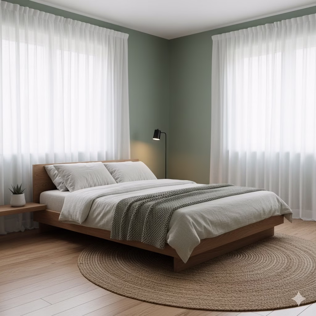
Color Ideas for Nature-Inspired Green Palette
Green is a color that everyone sees as calming. It helps bring feelings of balance and harmony. Green gets its power from nature. A green color plan brings the freshness of the outdoors inside. This helps to heal and refresh the mind.
Shades of Serenity and Natural Growth
5. Sage Green: The Ultimate Relaxer
A muted, gray-green is perhaps the most popular and flexible choice for Zen rooms. Sage green is gently calming and easy to adapt. It can work as a neutral color and looks lovely with both light wood and creamy white. It is a color that feels calm, restful, and never too much.
Pairing Sage: Use sage green on large wall areas. Then, use crisp white trim to make the color pop just enough. This combination is clean and restful.
6. Forest Green: Deep and Cozy
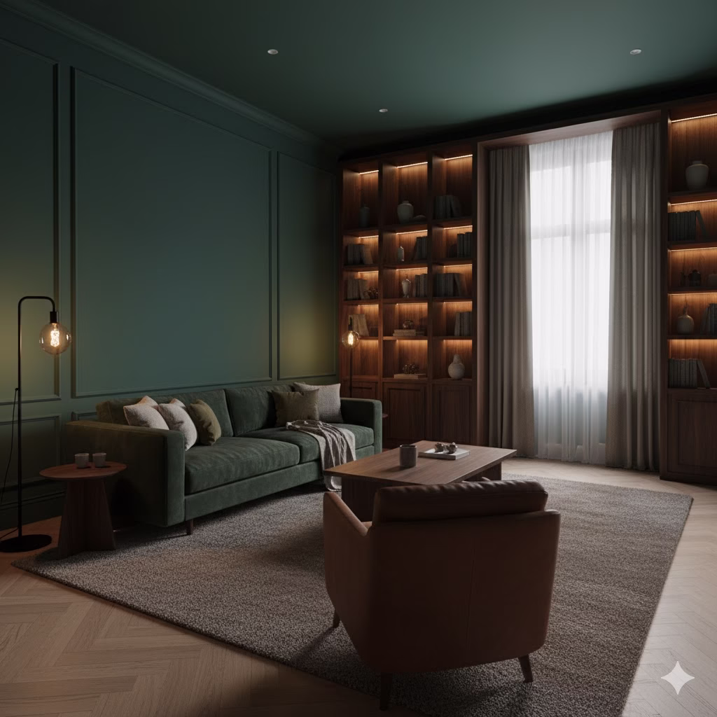
If you want a look that is more dramatic or cozy, deeper shades like forest green create a wonderful, hiding atmosphere. This shade works very well on one main wall, or through soft velvet fabrics. This is best when you use it with rich, natural wood furniture that reminds you of a thick forest.
Creating a Cocoon: Use forest green in a room you use at night, like a bedroom or media room. The darkness helps the room feel smaller and more protected.
7. Mint Green: Fresh and Bright
A lighter, more pastel green, mint green feels immediately fresh and renewing. It is a great choice for smaller spaces or rooms that need a boost of clean, quiet energy. It speaks of new life and lightness without being too bright or asking for too much attention.
Where to Use Mint: Mint is great for a home office or a kitchen. It gives a gentle lift to your energy without being distracting.
8. Dimensional Green Accents: Layering Calm
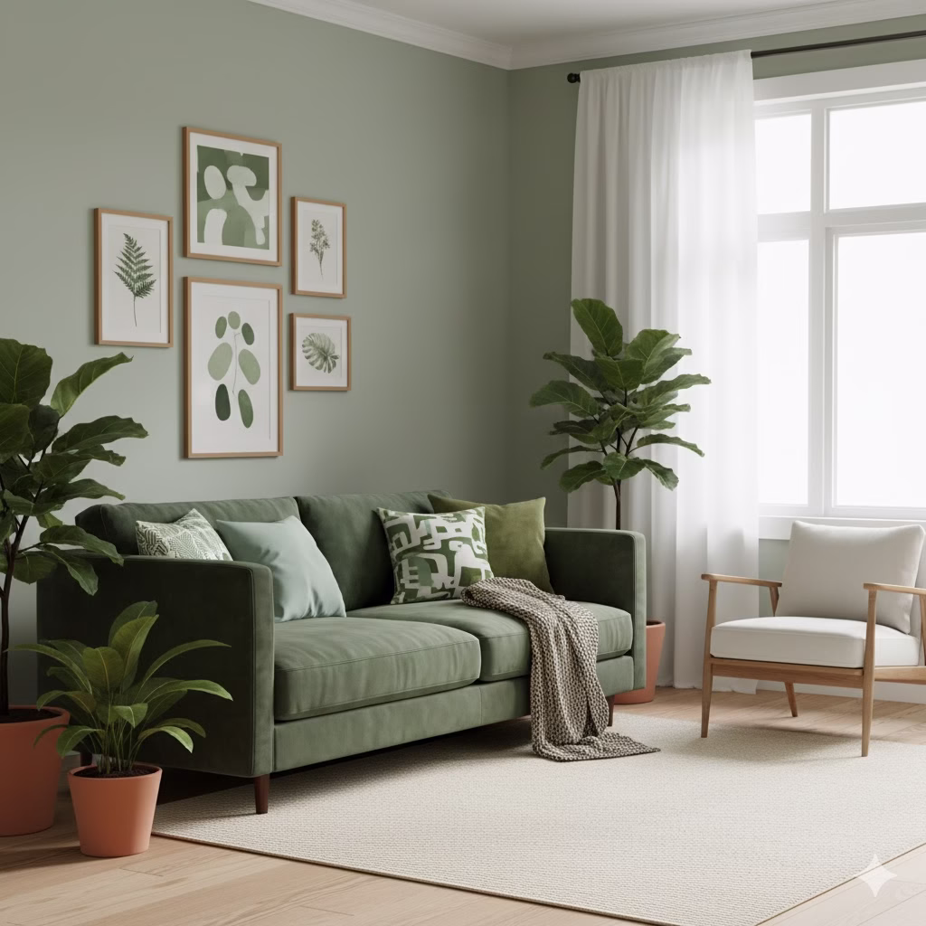
Instead of picking just one green, try mixing different shades. You could use a sage wall with forest green cushions. This helps to add depth. To keep the mood peaceful, always use white or a main neutral tone (like beige) to keep the whole look balanced. This stops the room from feeling too dark or busy.
The 60-30-10 Rule: For greens, try 60% neutral (walls/floors), 30% soft green (sage), and 10% dark green (forest green) in your accessories.
Color Ideas for Tranquil Water and Sky Palette
This set of colors is inspired by open water and wide skies. It is well-known for its power to create a feeling of space and lower worry. In terms of feelings, blue is often linked to calm, steadiness, and peace. This makes it a strong tool for a peaceful space.
Color Ideas for Hues for Peace and Clear Thinking
9. Pale Blue: The Clear Sky
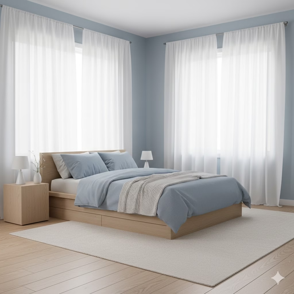
Lighter shades of blue quickly bring up a feeling of peace and serenity. They remind us of a calm, cloudless sky or a quiet lake. A powder blue or a very light sky blue is perfect for a bedroom. It can help you get deep and relaxing sleep.
The Effect of Pale Blue: Because it is a cool color, pale blue makes walls feel like they are moving away from you. This makes a small room feel much larger.
10. Misty Blue-Grey: Sophisticated Silence
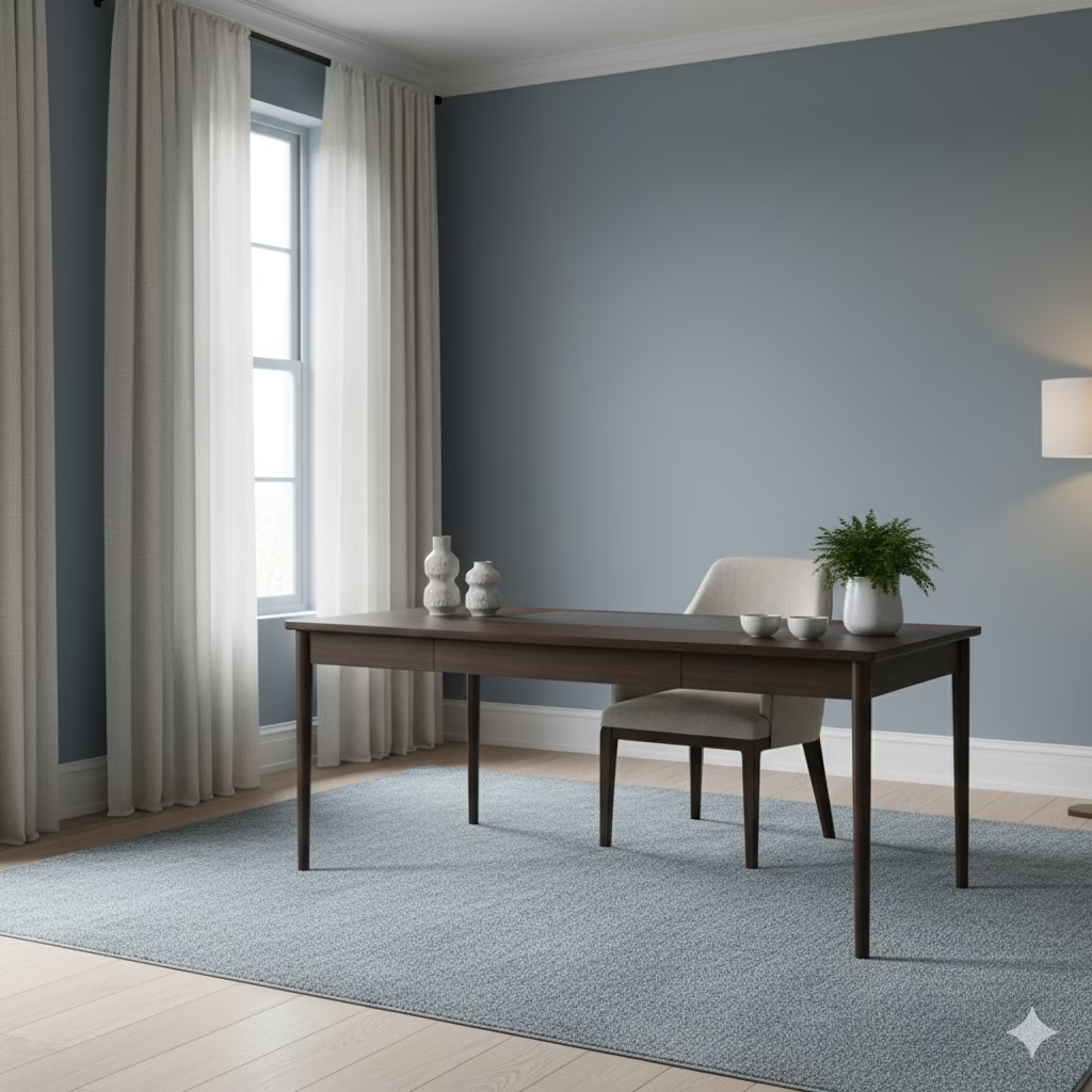
To get a cool, smart, and extra calming tone, mix blue and grey into a misty blue-grey. This soft color avoids the possible brightness of pure blue. This makes it an excellent wall color for a quiet office or reading area where you need to focus.
Why It’s So Calming: The grey in this color mutes the blue’s energy. The resulting shade is steady and supportive for deep thinking.
11. Light Aqua: Clean and Open
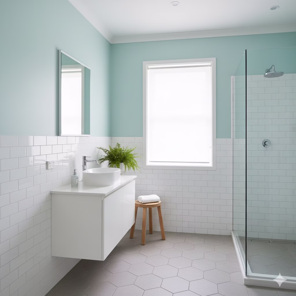
A very light, watery shade of aqua can feel clean, large, and gently energetic. It is the color of clear, shallow water—refreshing and bright without being too much. It is a lovely choice for bathrooms or areas where you want a feeling of clean space.
Use in Small Doses: Light aqua can be a wonderful accent color on an old wooden chair or a piece of glass art. It should feel like a splash of clear water.
12. Air and Warmth Pairing: Balancing the Cool

Use white to boost the feeling of cleanliness and openness when you use blues. To stop the space from feeling too cold, always match your water and sky tones with wood accents (like light oak or bamboo). This brings in needed warmth and grounding texture.
The Role of Wood: The reddish undertones in natural wood provide the perfect visual counter-balance to the coolness of blue. They complete the picture.
Color Ideas for Warm Desert Sunset Palette
While the Zen style often prefers cool colors, this option proves that warm color ideas can be just as calming. This is true as long as the color is not too strong. The Warm Desert Sunset Palette captures the soft light of the late day. It offers a natural, stable warmth.
Shades of Subtle Warmth and Earth
13. Soft Terracotta: Grounding the Room

A pale, burnt-orange shade, soft terracotta adds a rustic and grounding warmth without being overly exciting. It is a smarter way to use orange. And it feels old, solid, and incredibly comforting. It is perfect for adding a soft hint of life to a room that is mostly neutral.
Terracotta’s Texture: This color looks best when paired with rough, matte textures like natural clay pots or stone tile. This brings out its earthy quality.
14. Pastel Peach: A Subtle Glow
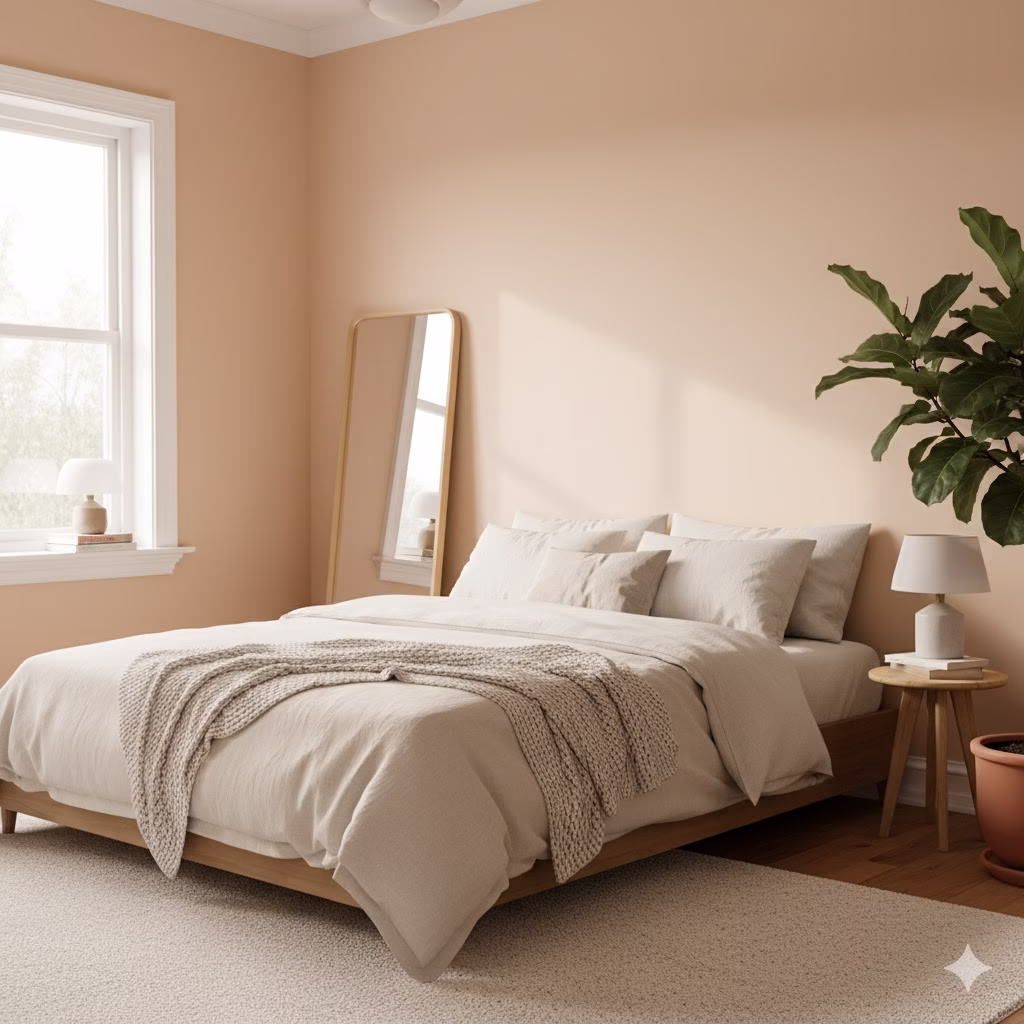
A soft, pastel peach gives a gentle, subtle energy while still being soothing. It is a kind color that reflects a beautiful glow onto your skin. It creates a happy but calm mood, reminding you of the first or last light of the day.
For a Flattering Space: Peach is a great color to use near mirrors or dressing areas. The warmth is very complimentary.
15. Dusty Rose: Nurturing Comfort
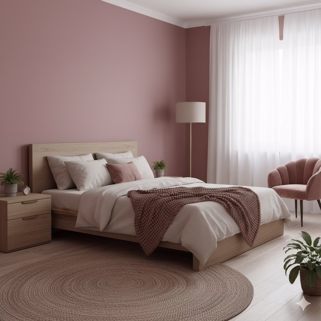
A muted, deep pink tone, dusty rose can feel deeply nurturing and comforting. It is a smart, grown-up pink that works well for fabrics like linen throws, velvet pillows, or a simple rug. It adds a feeling of softness to the whole room.
Best in Fabric: Keep dusty rose off the walls and use it for soft, touchable items. The texture makes the color feel richer and more comforting.
16. Cozy Complementary Pairing: Soft and Inviting
To keep the soft, cozy feel of this palette, always use creamy whites for door frames and ceilings. Also, rely heavily on natural woods and textured fabrics (like cotton or wool) to anchor the warmth. This stops the space from becoming too visually loud.
Maintaining Balance: The rule is simple: If your main color is warm (terracotta), make sure your second and third colors are a very light neutral (cream) and a texture (wood).
Color Ideas for More Zen Design Principles
A peaceful space is more than just color. It’s also about how you use that color. Here are more tips to bring harmony to your entire room.
Focus on Negative Space
In Zen design, the empty space is just as important as the items in it. When you use your chosen colors, make sure there is plenty of wall space left untouched. A simple, neutral wall allows your mind to rest. Do not fill every wall with art. Let the color breathe and let your eyes have a place to pause.
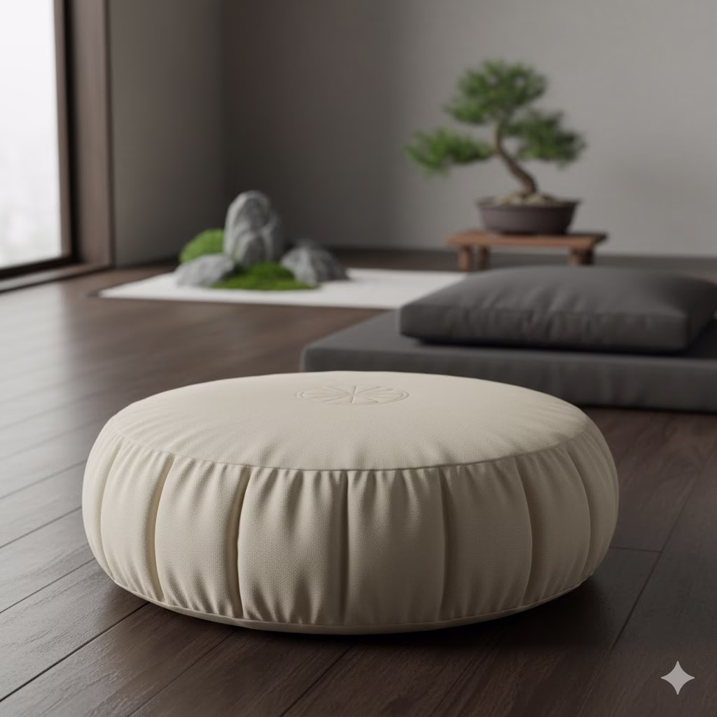
Introduce Low-Lying Furniture
Low furniture is a common feature in Zen-inspired homes. This style forces your line of sight downward. It grounds you to the earth. When you use low sofas, simple platform beds, or floor cushions, the colors you choose seem to support the weight of the room better. For example, a low, cream-colored sofa against a sage green wall looks calm and solid.
The Power of Repetition
For a truly peaceful space, repeat your core colors. If you use a Misty Blue-Grey, repeat that color in at least three different spots: the wall, a vase on the table, and a small area of a rug. This repetition creates a visual rhythm. This rhythm is quiet and steady, which helps your mind relax.
Tips for Choosing Your Perfect Zen Color Palette
Selecting a color plan is just the first step. To make sure your chosen colors lead to a truly peaceful space, follow these important design rules.
Start with a Base
Your walls take up the most space, so they are the most important factor. Choose a main neutral, earthy tone like beige, off-white, or a pale green for your walls. This will quickly create a huge, soothing background. The base color ideas should be the calmest shade in the entire room.
Use Accents Sparingly
Zen spaces celebrate being simple. Bring in your more special colors (like terracotta, forest green, or blue-grey) through accessories. Use items like soft blankets, small pillows, ceramic pieces, or art. A helpful rule for keeping things simple and calm is to limit your whole color plan to 3 to 5 colors in total.
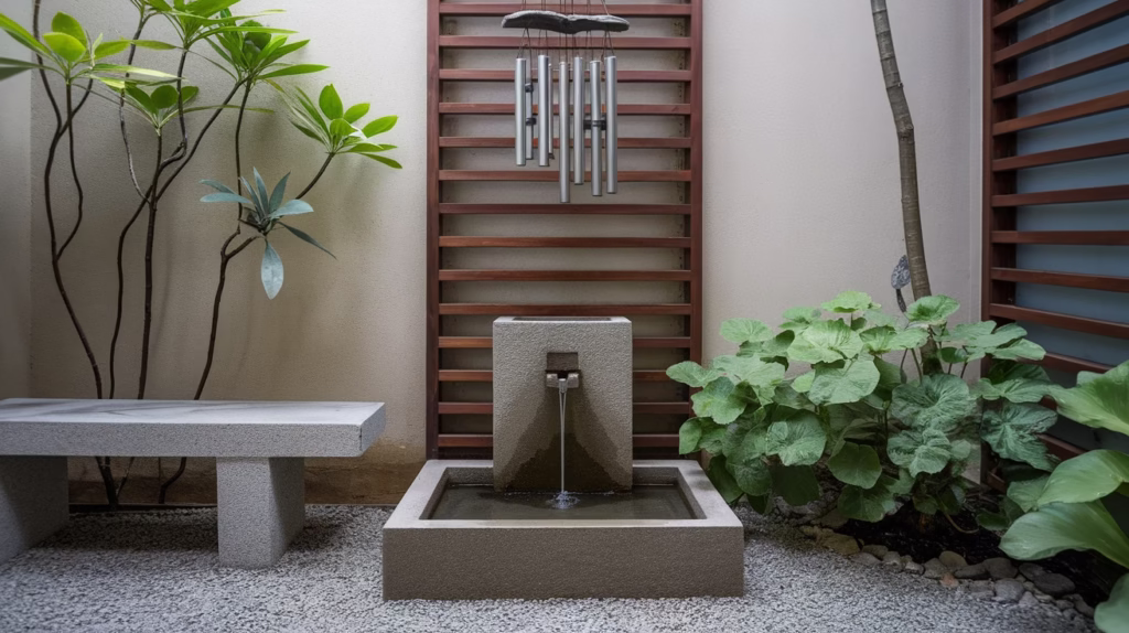
Incorporate Natural Materials
The color, ideas you pick should be made better by the textures you bring in. Use natural materials like wood (bamboo, oak), stone, jute rope, and linen fabric. These natural textures add depth and a key natural feel. This feel supports the Zen idea of being connected to nature. It makes the colors feel more real and stable.
Consider the Lighting
Lighting is the most important part of how to see your color ideas. Always test paint colors in your room at different times of day—when the sun rises, in the middle of the day, and when the lamps are on at night. Warm, soft lighting (like lamps with dimmers) can make colors like beige and terracotta feel cozier. Natural light will show any subtle cool or warm colors mixed in your chosen paint. Do not use harsh light from above. This can wash out subtle colors and make the room feel unwelcoming.
The Path to Peace
Creating a peaceful, Zen-style space is less about following a trend and more about making a specific feeling. By picking from these 16 easy color ideas, you are taking the first, strongest step toward making your home a personal sanctuary. Whether you like the solid power of earth tones, the healing calm of greens, the vast peace of blues, or the gentle warmth of the desert, your chosen colors will serve as a constant, quiet reminder to breathe, slow down, and simply be yourself.
Which of these four main palettes—Earthy Neutral, Nature Green, Water & Sky, or Desert Sunset—feels most like your personal idea of peace?
References
- Escapology Home – The Psychology of Colour in Interior Design
- Piktochart – The Best 15 Zen Color Palette Combinations
- Swavelle – Color Psychology in Interior Design
Recent Posts